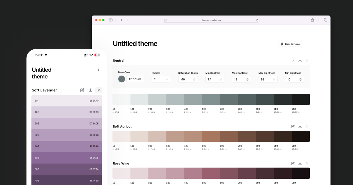
It’s not like the internet is short on color tools. But most of them are either too basic—fine for quick inspiration boards but not production—or overengineered generators that still miss a critical capability:
Adjusting lightness, contrast, and saturation curves across a palette to keep shades harmonious while maintaining proper contrast in both light and dark modes.
As someone who’s built and maintained design systems for large-scale products, this gap wasn’t just an annoyance—it was a recurring, time-consuming roadblock.
The pain is real
When you’re responsible for design systems serving multiple platforms, brands, and millions of users, color isn’t just decoration—it’s a functional part of the product.
Yet building an accessible, harmonious palette across modes is messy:
- Fix a color in light mode, and it fails contrast in dark mode.
- Add one shade, and the tonal balance breaks everywhere.
- Spend hours juggling calculators, spreadsheets, Figma, pickers, and preview tools—only to still tweak values manually.
Over the years, I tried countless generators. Some looked sleek, some had advanced exports, but none actually solved the workflow problem I faced every time I refined a system.
How does another color generator solve the problem
I didn’t want “another pretty palette maker.” I needed a system-aware generator that could:
- Start from a single brand or base shade and produce evenly balanced variants.
- Offer fine control over lightness, contrast range, and saturation curves.
- Keep WCAG compliance intact across light and dark modes automatically.
- Add or adjust shades without breaking the rest of the system.
- Export directly into developer and designer-friendly formats—CSS variables, JSON, or Figma.
When I couldn’t find a tool that did all that for free, so, I built one for myself.

How it actually Works
It starts with your base color—the shade defining your brand’s visual character—and then:
- Evenly spaces lightness values across your shades within user-defined min and max limits, ensuring visual consistency.
- Saturation Curve Control – Lets you shape saturation:
- Linear – steady change across shades
- Arch-shaped – most saturated in the middle
- U-shaped – more saturated at the ends
This helps preserve your brand’s tone, from muted elegance to bold vibrancy.
- Prioritize to keep the exact hex value of the base color, but if it breaks harmony or contrast, it generates a visually identical alternative that fits better. Accessibility and harmony outweigh a stubborn hex value.
- Validates contrast ratios for both modes to keep text and UI accessible.
- Add shades without breaking the pattern, curves and balance are preserved.
The result is a palette that’s harmonious, accessible, and brand-aligned—without choosing between beauty and usability.

The Impact on My Workflow
Palette creation has gone from a stressful, multi-tool juggling act to a smooth, predictable process. I can add and adjust shades without worrying about breaking the harmony of the existing set, and I know accessibility is handled from the start rather than as an afterthought.
Engineers get exactly the variables they need without manual copy-pasting from Figma.

What’s Next?
I didn’t build Themer to compete with other color generators. They each have their own strengths and purpose. I built it to do exactly what I needed, in the way I needed—and decided to share it in case it helps someone else.
It will always be free.
Future updates may (or may not) bring advanced controls and design tool integrations, but the principle stays the same: accessibility, harmony, and real-world workflow over chasing perfect hex codes.
Would you like to give it a try?
